
OVERVIEW
I designed a personalized experience for Zappos users on the mobile application. Features such as favorites and lists help overwhelmed users shop with more intention and organization, and bring them back for more frequent purchases. I designed for both iOS and Material Design.
TIMELINE
Jun 2017 - Aug 2017
ROLE
Lead Designer - research, design, development support.
TEAM
Product Manager, Project Manager, iOS Developer, Android Developer, Product Designer (me)
CHALLENGE
Deliver a more customized experience for overwhelmed Zappos customers to find what they need on the app.
Customer feedback revealed that Zappos users faced an overwhelming amount of content on mobile shopping applications. With the mobile applications having much higher rates of engagement and conversion, users need a way to filter their experience to find the right products efficiently and effectively.

OUTCOME
I created a favoriting and list experience for Zappos users to find, compare, and return to their most-loved items.
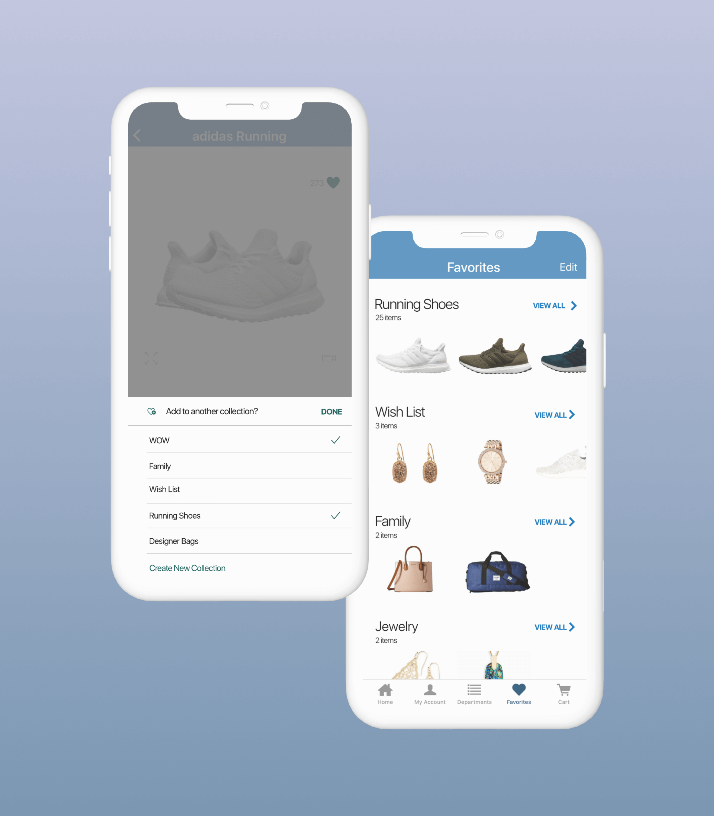
This was the first time users could personalize their shopping experience by saving their favorite items.
The higher user engagement is projected to increase user retention and checkout rates.
PROBLEM SPACE
Business Landscape: Zappos is an online retailer well-known for its outstanding customer service and loyal customer base. As the company has grown its offerings, users have reported feeling overwhelmed with all the options. For Zappos, if a user can't find exactly what they're looking for, compare existing options, or save items they're interested to come back to later, it means lost business,
User Problem: Zappos users love browsing their inventory, and whenever they need to purchase something, Zappos is the first place they look. The massive amounts of products that Zappos now offers leave users feeling overwhelmed or unsure if they've found the best possible option. They also want a way to save items for later or view more tailored products based on their past spending patterns.
RESEARCH
Zappos had existing customer data in large quantities from recent surveys. I deep-dived into this research to learn about our customers' problems and identify trends.
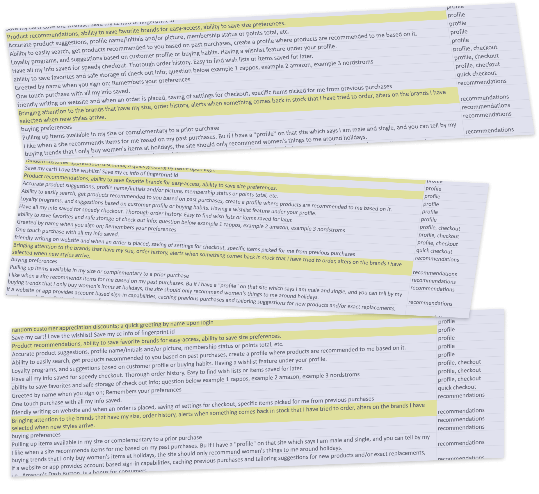
Users valued:
- Having a profile: social, sharing
- Multiple lists: comparison shopping, saving for later.
- Saved information: sizing, brand preferences.
- Recommendations: from purchase history and similar products
BRAND LOYALTY
Zappos users are extremely loyal and are interested in first using their website to find options.
SHOPPING JOURNEYS
The indecisive shopper..
The comparison shopper..
The spontaneous shopper..
PERSONALIZATION IMPACT
Helping users sort through overwhelming amounts of information to make the best decision for themselves.


DESIGN SPRINT
Our design sprint helped us learn more about the problem space, align with our cross-functional team, and uncover potential solutions.
Timeline: 3 days
Teams present: UX Design, Android and iOS teams, Product Manager, Project Manager, and Head of Mobile.
FINAL SOLUTION SKETCHES FROM THE SPRINT
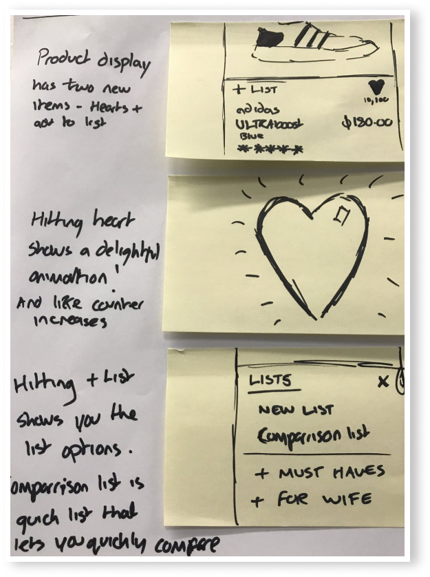
MVP
This was the top voted flow. It features simplicity in interactions and quick ways to favorite and compare items.
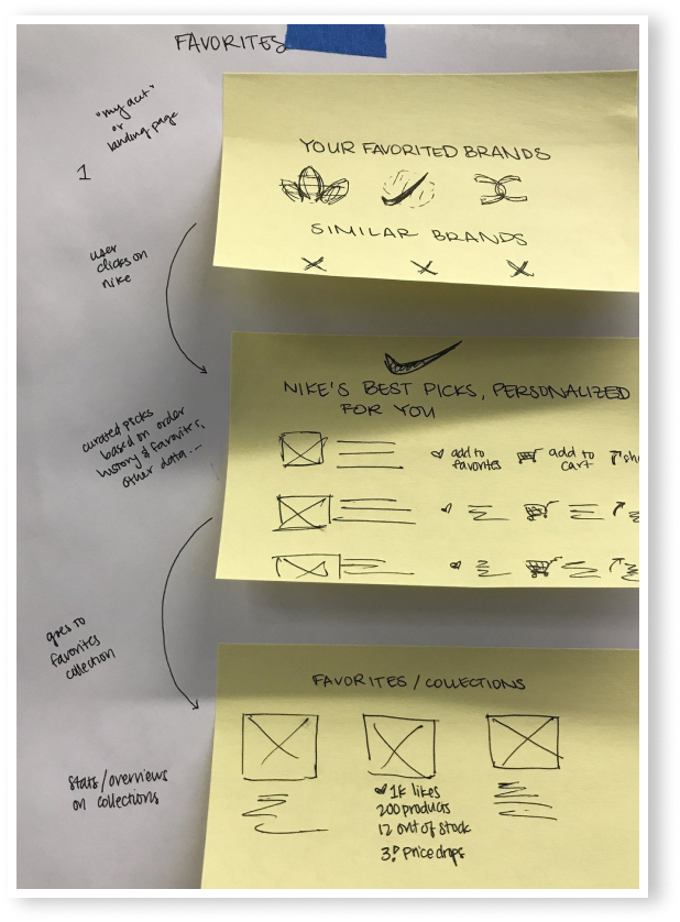
LONG TERM GOAL
Over time, the team shared a vision of also including social value and personalized recommendations.
USER STORIES
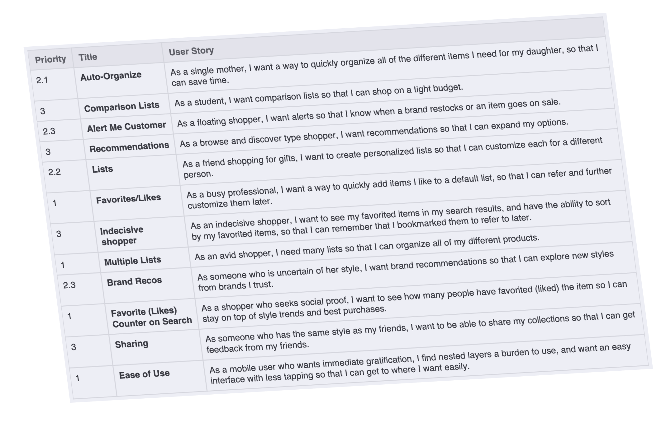
I developed user stories based on the Sprint outcome and research data. These stories focused on the functionality needed but were also set in the context of our personas' goals to build empathy.
FAVORITES
"As a busy professional, I want a way to quickly add my favorite items to a default list, so that I can refer to them later."
MULTIPLE LISTS
"As an avid shopper, I need more than one list so that I can organize and compare different products for different purposes."
WIREFRAMING
Our user stories helped us determine what to focus on for this project: Favoriting and Lists.
Once the direction was set, wireframing was especially useful to determine the multiple list homepage layout.

HIGH FIDELITY MOCK UPS
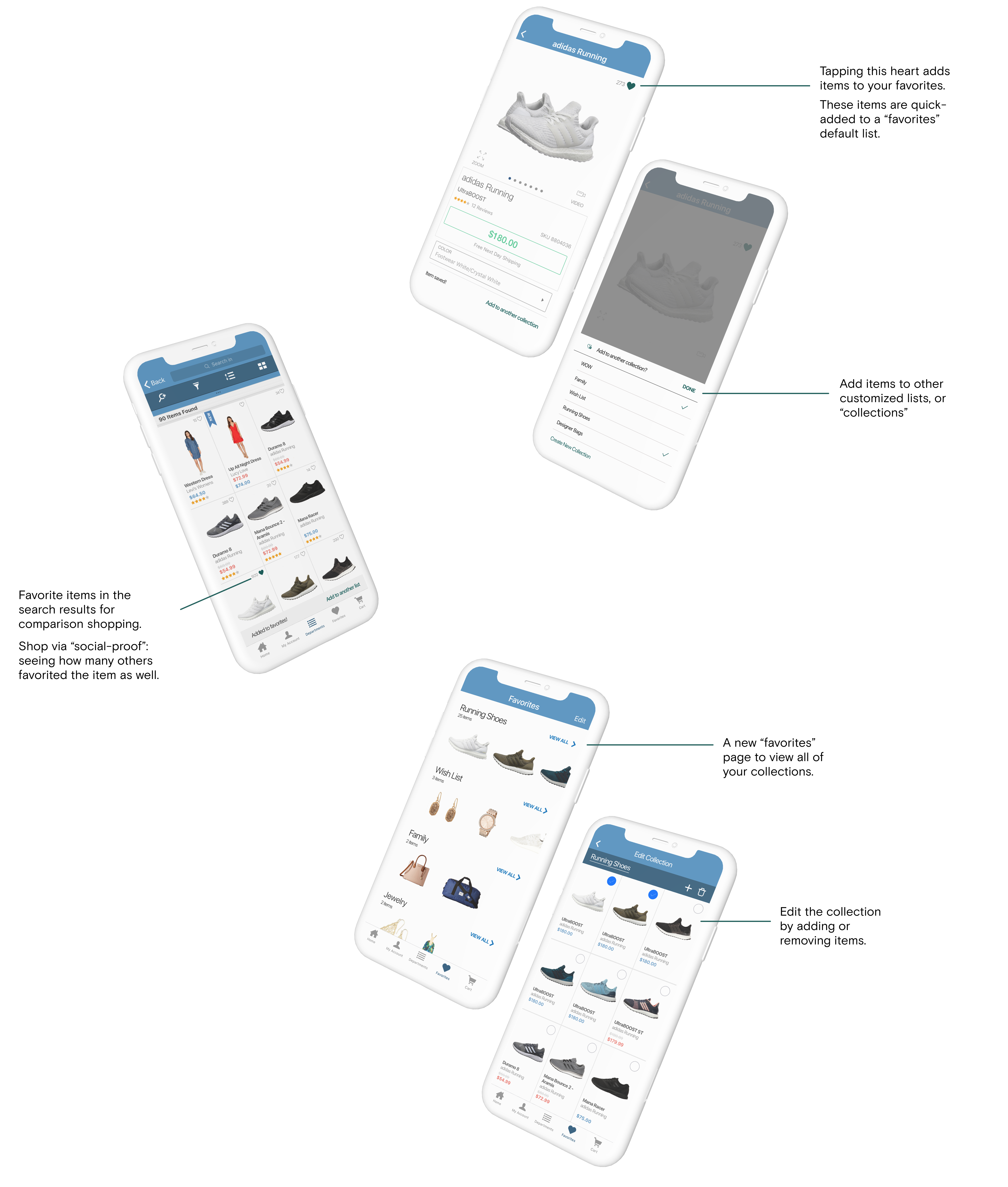
U S E C A S E S
to fit different shopping journeys

(left to right): Comparison Shopping, Social Proof, Save For Later
MAXIMIZING EMPTY STATES
New users can learn how to leverage the feature to improve their experience.
CONTEXTUAL ONBOARDING
Ensures that the user is getting the information at a relevant time.
ONBOARDING

INTERACTIVE FLOWS
Help users learn through doing.
CELEBRATING SUCCESS
Provides positive reinforcement to continue using a feature.
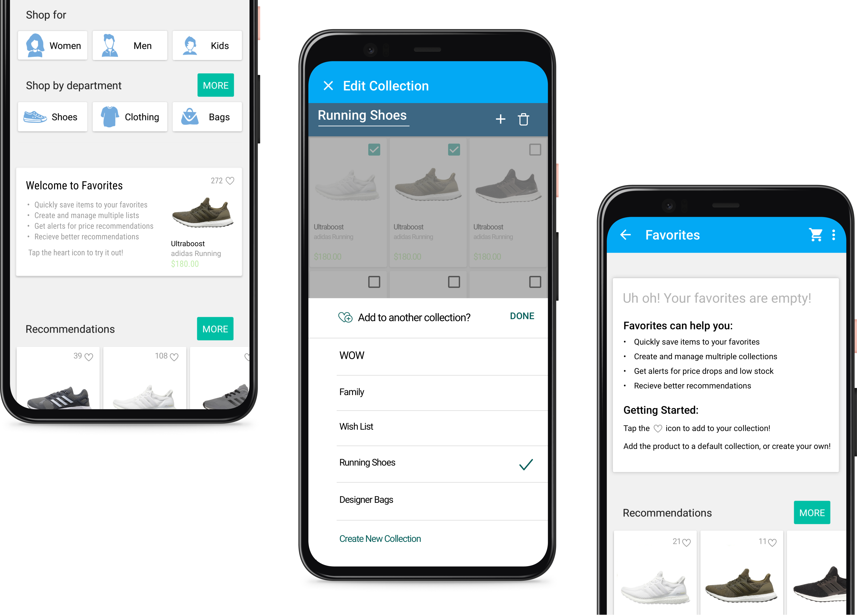
MATERIAL DESIGN
All mock ups were also translated to fit Material Design.
IMPACT
I designed the first personalization experience for Zappos customers that transforms the way they use and spend time on the application, leading to higher check-out rates.
BUSINESS VALUE
Increased user retention and more time in the Zappos app - creating, editing, and viewing favorites and customized lists.
USER VALUE
Users are empowered with a more personalized experience through favorites and their lists — whether it's for comparison shopping, saving for later, or social-proof.
LEARNINGS
Foster collaborative cultures and build trust amongst cross-functional teams.
By including the cross-functional team early on with a Design Sprint, everyone had a voice and influence in the final direction we chose. This created early buy-in from all stakeholders.
Use constraints to drive a more powerful experience.
This project lacked back-end support, and due to that constraint we weren't able to work on the web or mobile versions of Zappos.com. However, that allowed us to deliver a project that was centered around the in-app experience, for users to take on the go with them anywhere.