
OVERVIEW
My product design work on vSphere Services was critical in transforming vSphere, VMware's flagship product, into a service-centric platform to provide modern, cloud-like consumption experiences for VMware's customers.
TIMELINE
Jul 2020 - May 2021
ROLE
Lead Designer - user research, end-to-end design process, aligning with business strategy, & implementation support.
TEAM
Product Manager, Architect, Engineering Manager, UI Lead, & Product Designer (me).
CHALLENGE
Find a way for vSphere users to benefit from modern services that are available in the public cloud, without having to leave vSphere.

OUTCOME
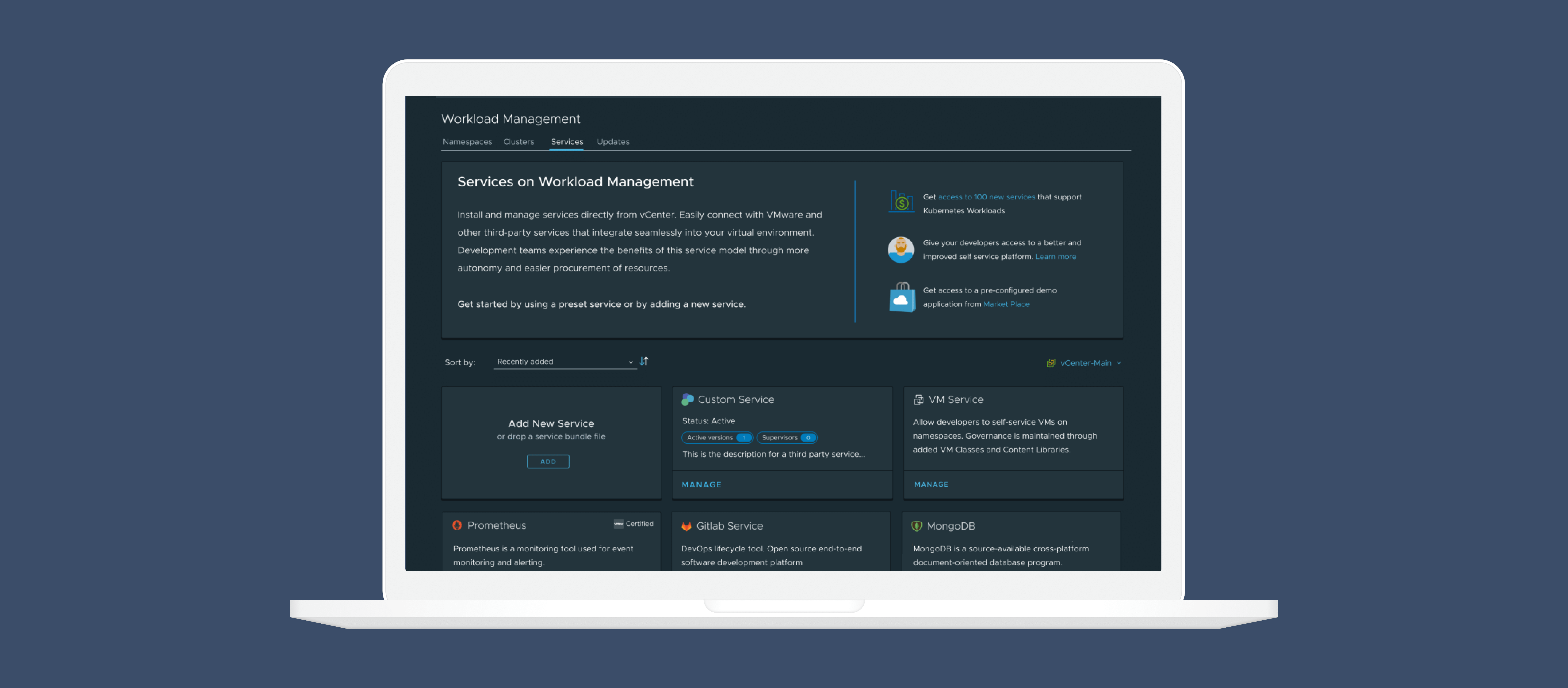
I created new value for vSphere users by designing a cloud-like consumption experience that runs on top of vSphere, where users can leverage services to modernize their applications and improve their efficiency.
who are we solving for?
Shifting the focus from a key business priority to solving a user problem through human-centered design.
Moving towards modern, cloud experiences and transforming to SaaS is one of VMware's key business priorities. When this project was first introduced to me, one of my first questions was: who are we really solving for? This was an ambiguous, complex, and evolving space, and there were many unknowns.
My goal was to start a conversation around who this impacts and shift the focus from fulfilling a business goal to solving a user problem.
My role here was to partner with my Product Manager and Architect to learn more about the problem space and where our users were currently at. From there, I was able to conduct my own desk research to better inform our solution.
CRAFTING THE VISION THROUGH USER RESEARCH
Customers
Our customers are CIOs or CTOs at companies that choose to purchase VMware products. They could be big banks, in health care or government. They care about saving money and minimizing downtime, so switching platforms isn't viable.
Hands-on Users
VI (Virtual Infrastructure) Admins manage infrastructure and provision resources for their app development teams. They care about keeping their infrastructure secure, healthy, and running.
Developers on these application teams are consuming services, creating virtual machines, and building applications for the company. They want to build apps quickly with the latest tools.

Service Providers
In this project's ecosystem, we also had to consider independent software vendors. These ISVs are creating services and are looking for platforms to add their services to, so users can consume them.
COMPETITIVE RESEARCH
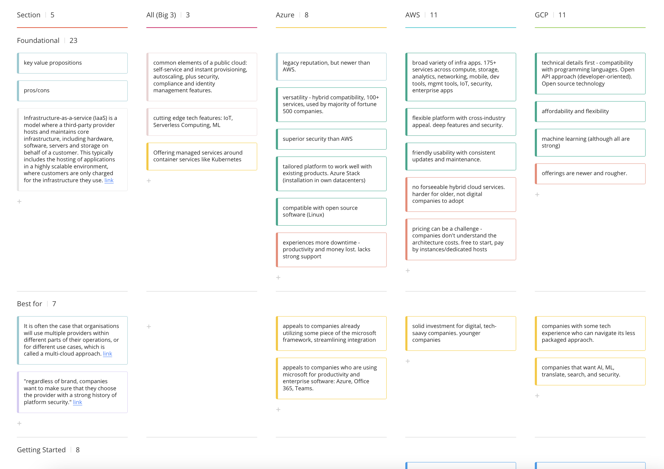
Studying the big three cloud providers gave me a solid understanding of what the market was offering and where VMware could go strategically.
During this time, our design team had realized we weren't doing enough competitive research. Even though we were all working on different projects, they were all related to the cloud market, and I saw the value in us carving out time each week to advance our knowledge in the competitive space.
Below are some snippets of the research I did as a part of this competitive research initiative. This research helped me understand where the big three cloud providers were at (GCP, Azure, and AWS) and what strategic direction we should take at VMware.
USER NEED
Our users are at a cross-roads — they want cloud-like consumption services but are too heavily invested in their current infrastructure to easily make the switch.
BUSINESS GOAL
VMware needs to keep up with the move towards cloud, and for customers heavily invested in vSphere, we need to find a way to meet their modern needs while maintaining their traditional environments.
PROJECT GOALS
Build a service platform for VI Admins and Developers to consume, discover, and create services.

My discovery research narrowed down the scope of our project, and took it from an ambiguous, pie-in-the-sky idea with dozens of directions to a concrete and actionable plan.
Our priorities were to first enable consumption of services, then help our users discover new services to meet their needs. We also wanted a way to help third-party users write services for our platform, similar to a software development kit, to guide them.
STRATEGY
Deeply understanding our users gave me a clear path forward when it came to defining the strategy:
- Save companies time and money by adding additional value in vSphere
- Give VI Admins job security and confidence by using familiar system terms and architecture
- Empower developers with more autonomy through self-servicing
- Provide independent service vendors with more visibility through a service marketplace
TESTING ASSUMPTIONS WITH USERS
I leveraged an assumption tracker to validate or invalidate the assumptions we were making in the formative stages of this project.
We have a design studio program at VMware to recruit our research participants, and designers are responsible for creating, running, and analyzing our own research. I used an Assumption Tracker to formulate questions based on each assumption. To analyze the research, I calculated the percentage of users who validated the assumption to rule each assumption as validated or invalid.

Our users shared that they were excited about the potential of using a service platform, and had hesitance but were overall open to the idea of developer self-servicing, if done right. Our users also found a service marketplace with VMware-verified services to fit their needs for service discovery and security measures. Users were completely against having an open-source community for services, since their companies would not allow it due to security risks.
MINDMAP
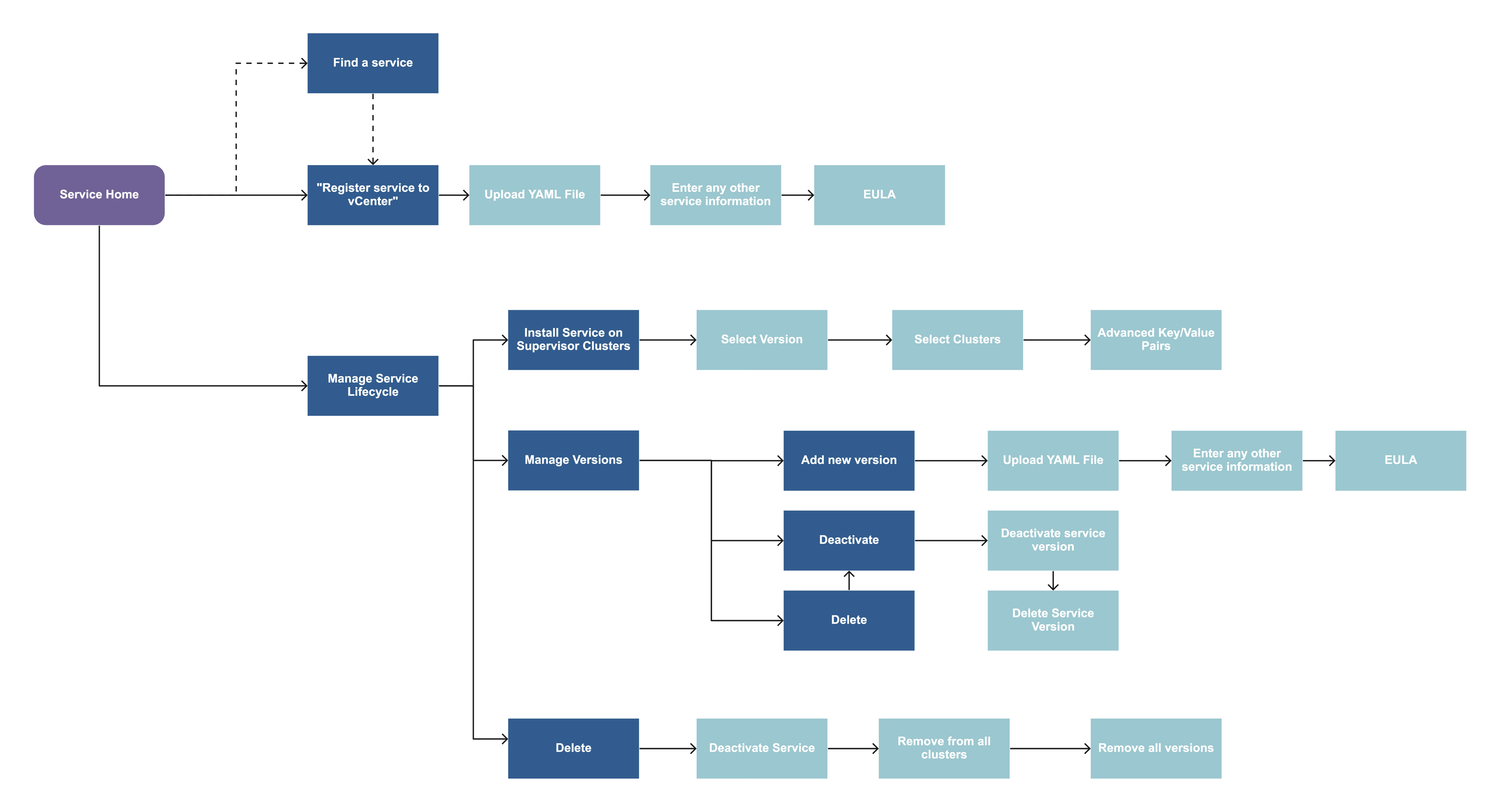
I wanted the new service page to be the central location for the new feature, but included other touchpoints to meet our users where they were and slowly transition them.

With the goals, research, strategy, and validation leading the direction for the project, I was now able to articulate all the touchpoints for setting up and consuming services. The mindmap shows where a VI Admin would go to set up and manage their service lifecycle.
I wanted the service homepage to be the central location our users interact with this feature so that the experience can be more powerful and cohesive. However, I also knew many of our customers loved being in the Hosts and Clusters view, which is a completely different part of the product. So our team decided to introduce some limited functionality in each Cluster's page, where Admins could fine-tune some details specific to the service on the cluster.
QUAD PROCESS
My quad had weekly meetings with the core team, where we discussed strategy, design, implementation, and everything in between.
Since this was a high-profile project that touched many other business units, we quickly saw that too many voices in the room caused misalignment between the core executing quad group. We decided to then have smaller syncs with just the core quad members and have larger shareouts with the broader stakeholder team periodically.
Our development team works in an agile process, so we try to get as much of the design direction finalized before they pick up the work. Since we aren't always able to start months in advance before development, I focus on finalizing the core flows quickly so that development teams can start discussing APIs and any other dependencies.
WIREFRAMES
I used wireframes as conversation-starters, to test the direction with my cross-functional team and discuss what type of information we would showcase at each stage.

INFORMATION ARCHITECTURE
I initiated many technical conversations with our cross-functional team as I encountered them in the designs. Understanding the platform architecture allowed me to craft the best ways to present this content to our users.
Since this project had many technical details, I initiated many of these conversations as I became blocked in the design. I brought up questions like "When a service is registered, what types of configuration parameters need to be entered? How will the user know what the correct values are?"
These questions sparked discussions around details our quad team had not yet considered, and helped me uncover the information architecture. Presenting these tasks in a way that made sense to the user was critical. That also included the terminology we were using and how we explained them.
CROSS-PRODUCT PATTERNS
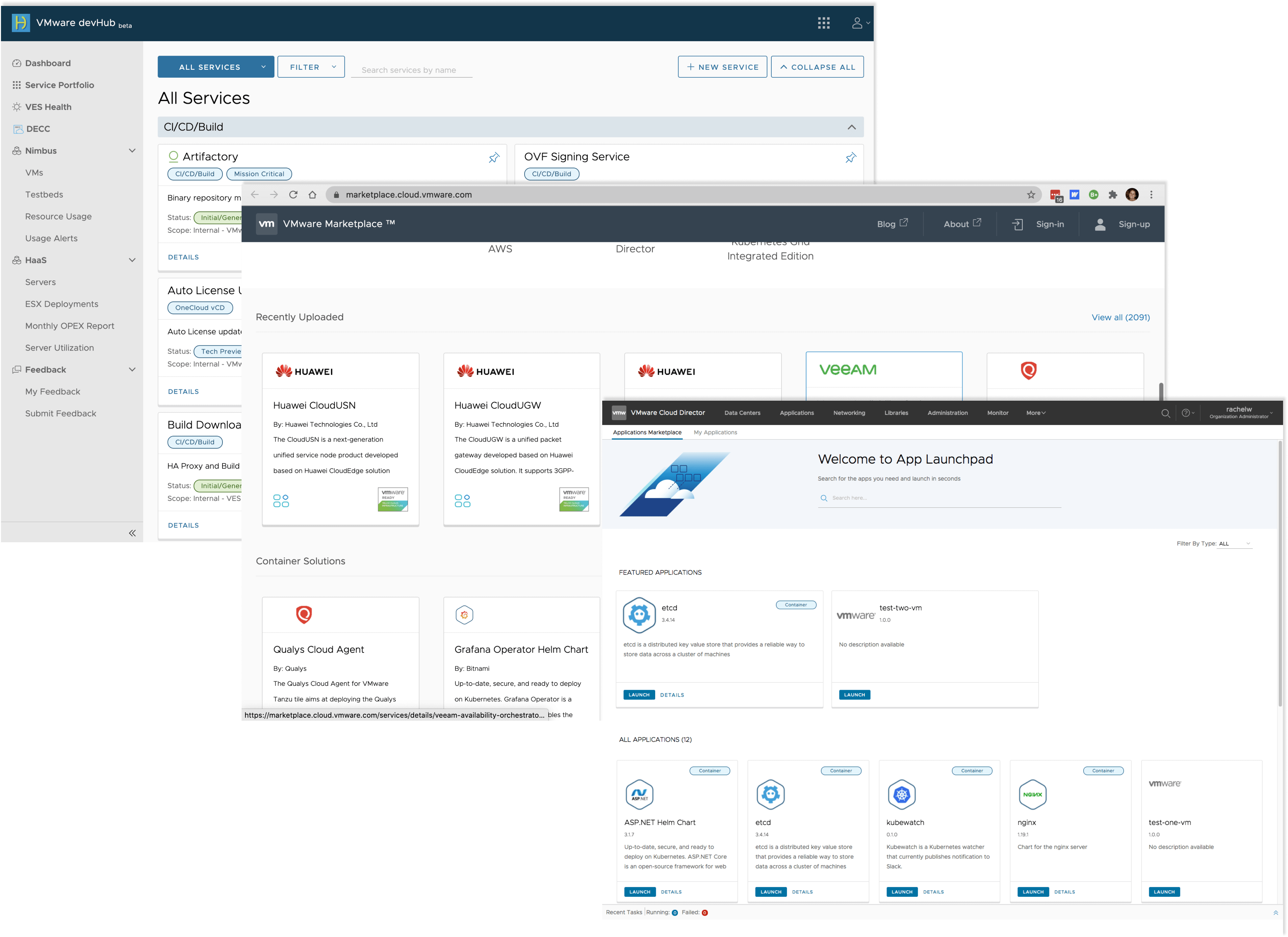
I make it a point as a designer to create some consistency across our products and offerings beyond just the design system.
Many of our other products have concepts of service catalogs, and I wanted to ensure that our pattern and approach was somewhat consistent.
EARLY CONCEPTS
I share my work early and often for feedback. This helps our team quickly validate directions and iterate on the details. Early design conversations also help me map out the exact constraints.
One of our biggest constraints was that each service would not have its own dedicated service page. So while the below design wasn't implemented, it served as a north star vision the team aligned around.
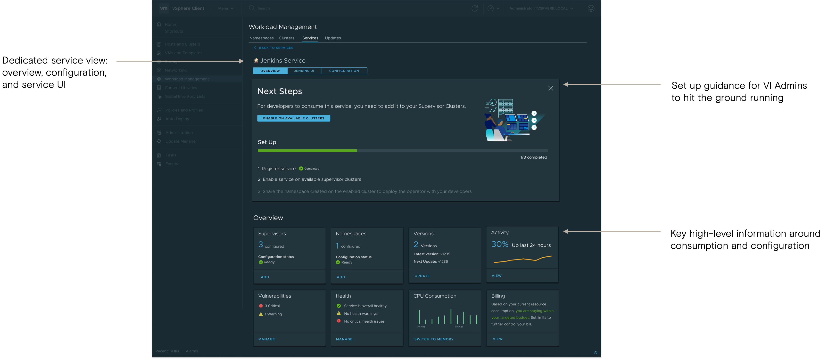
Early sharing of designs helped the team uncover any technical constraints.
Knowing these constraints early on helped me understand what we could target in the MVP experience vs. the long-term vision.

CHALLENGES
Through challenges, I represent the user but am also a team player through our shared sense of outcome and understanding of priorities vs tradeoffs.
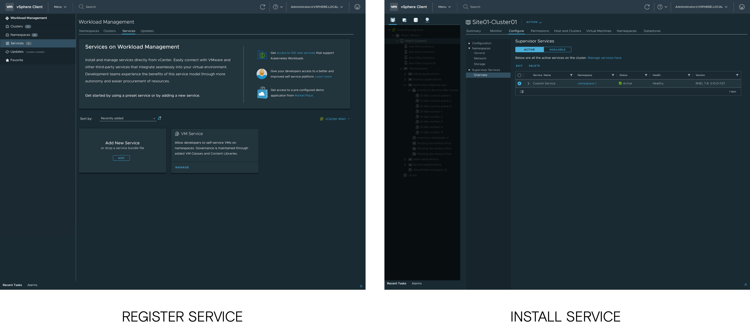
With turnover of 3 PMs and technical constraints between front-end and back-end teams, the UX had some key gaps. At this point, registering and installing the service were being done in completely different areas of the product due to engineering constraints. To emphasize why we should be putting resources into developing full flows, I encouraged our PM to share some of our designs with customers they were closely talking to.
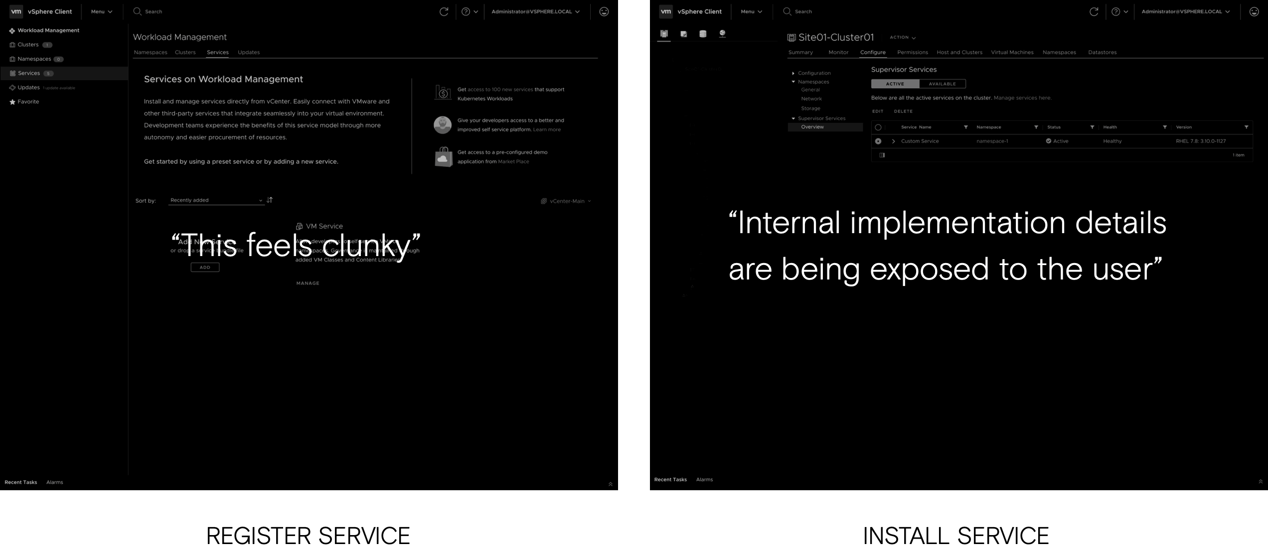
COMPROMISE & RESOLUTION
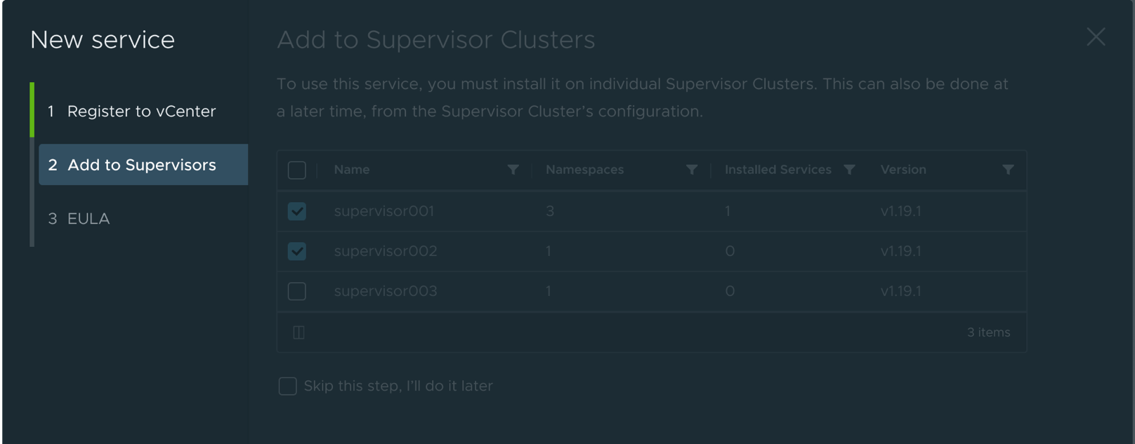
Once the team heard the feedback, their minds quickly changed and the release timeline was extended to improve the user experience. Ideally, I would have wanted registration and installation to happen at the same time (shown above) but this added additional complexity to the APIs that developers just couldn't get around for the MVP. So I found an alternate solution, compromising a bit of the ideal experience. The final solution is shown below.
FINAL DESIGN
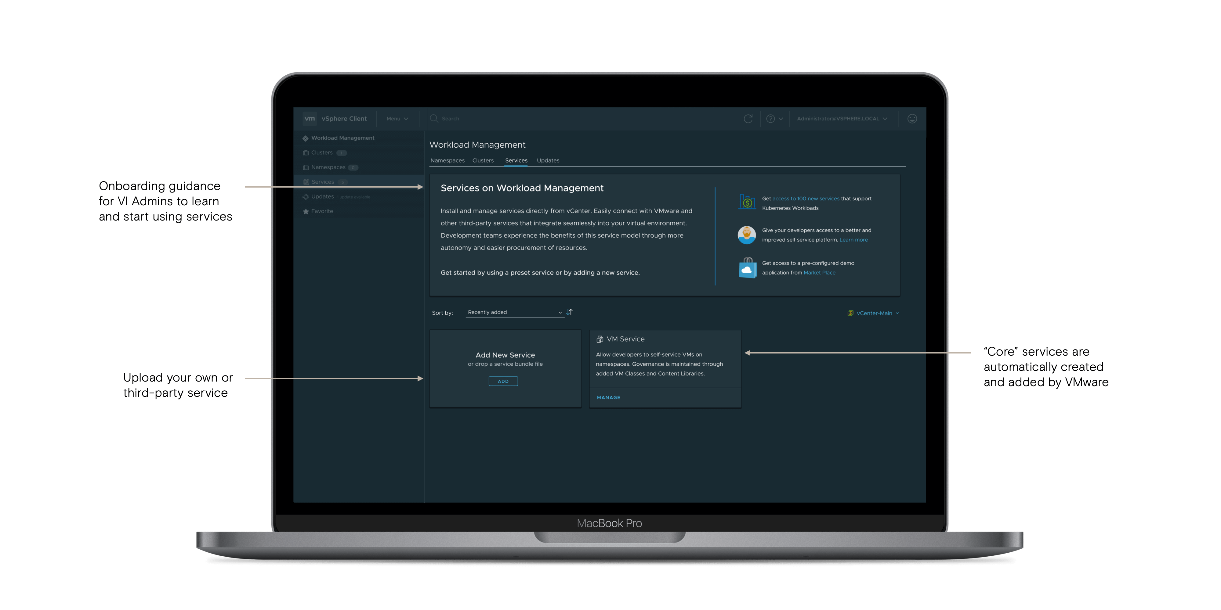
Registering and installing a service:

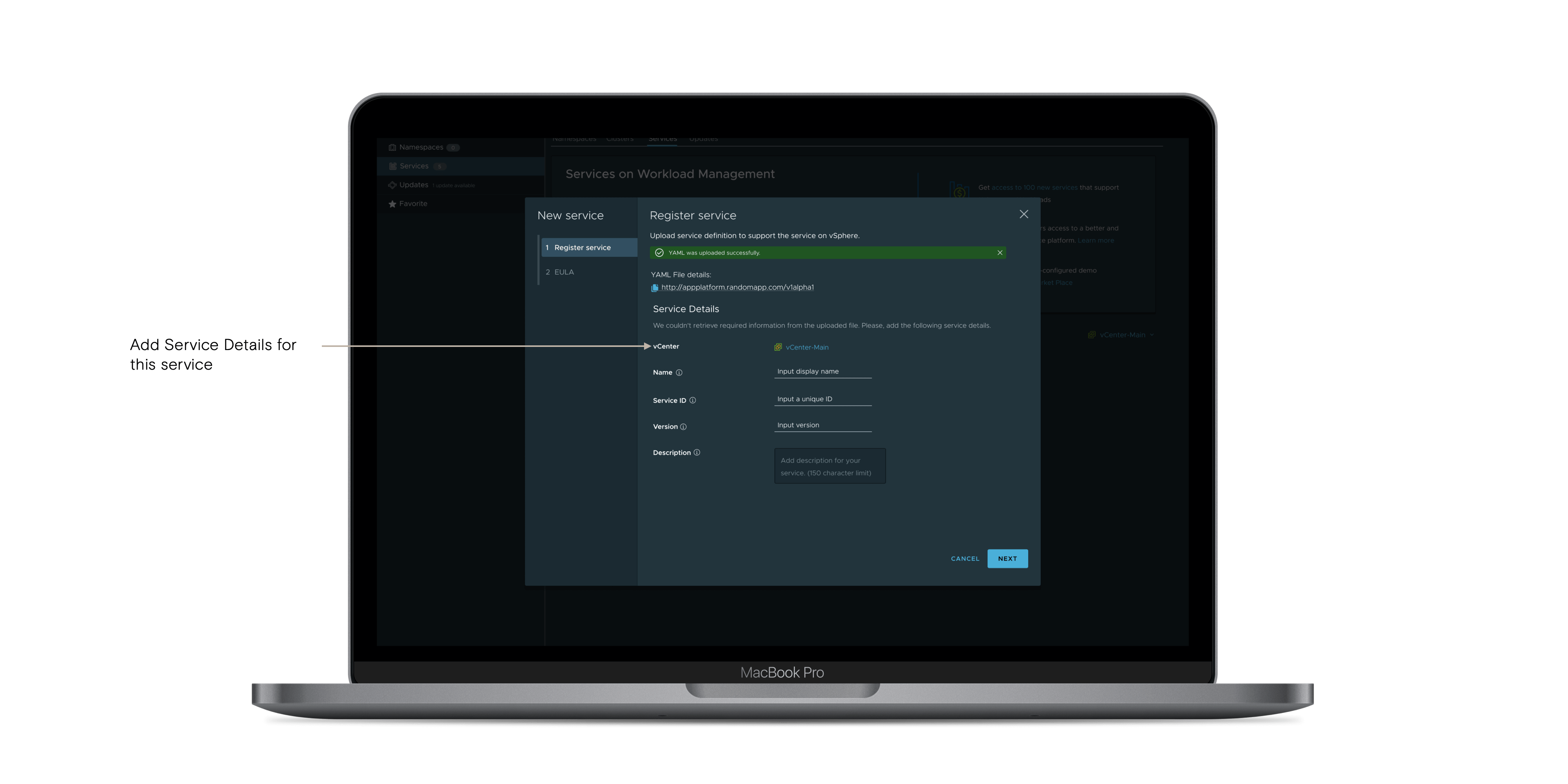
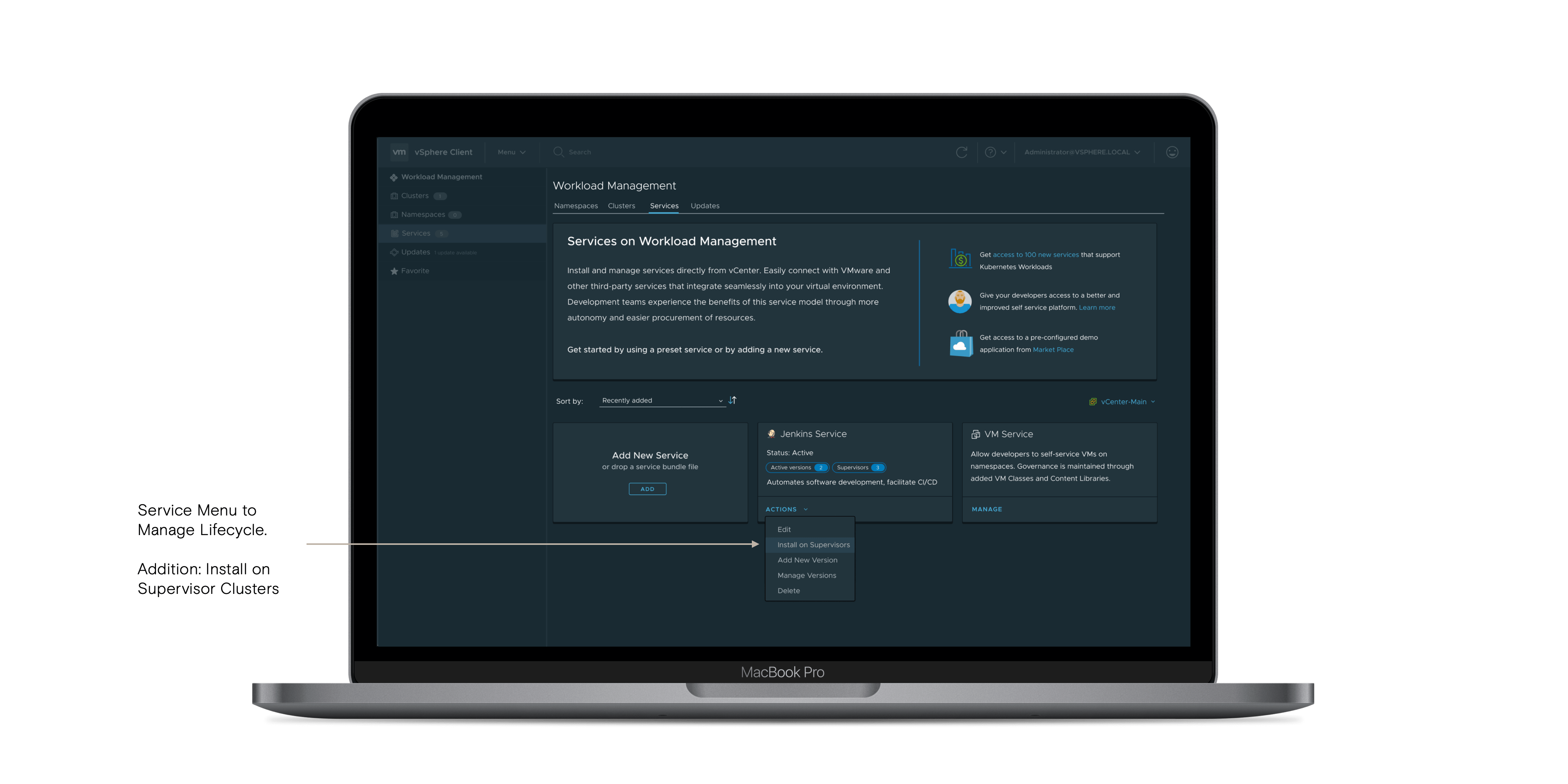
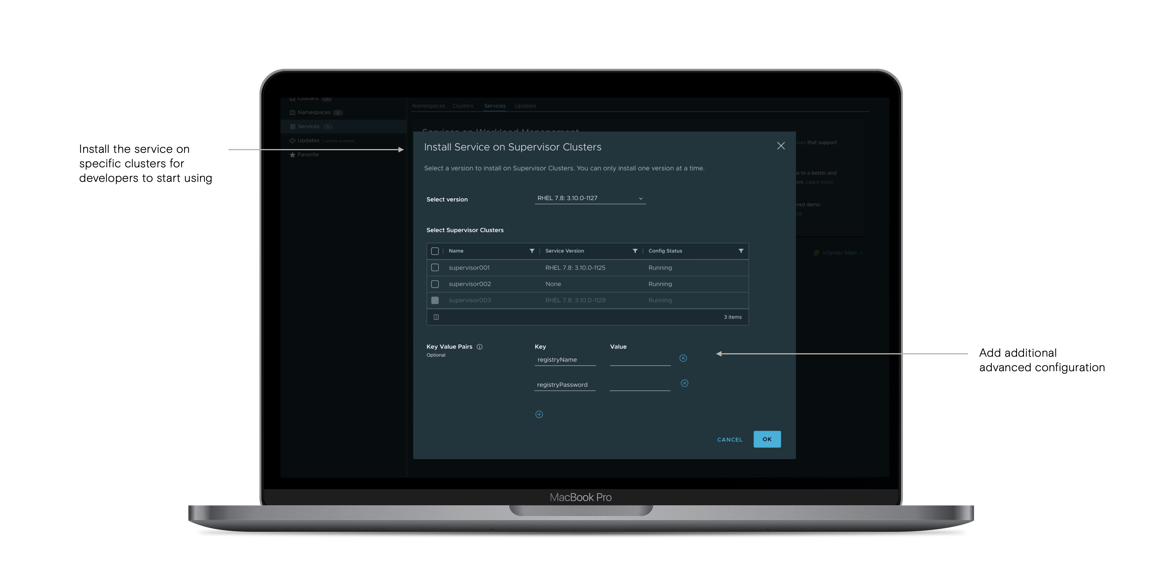
Managing service lifecycle:
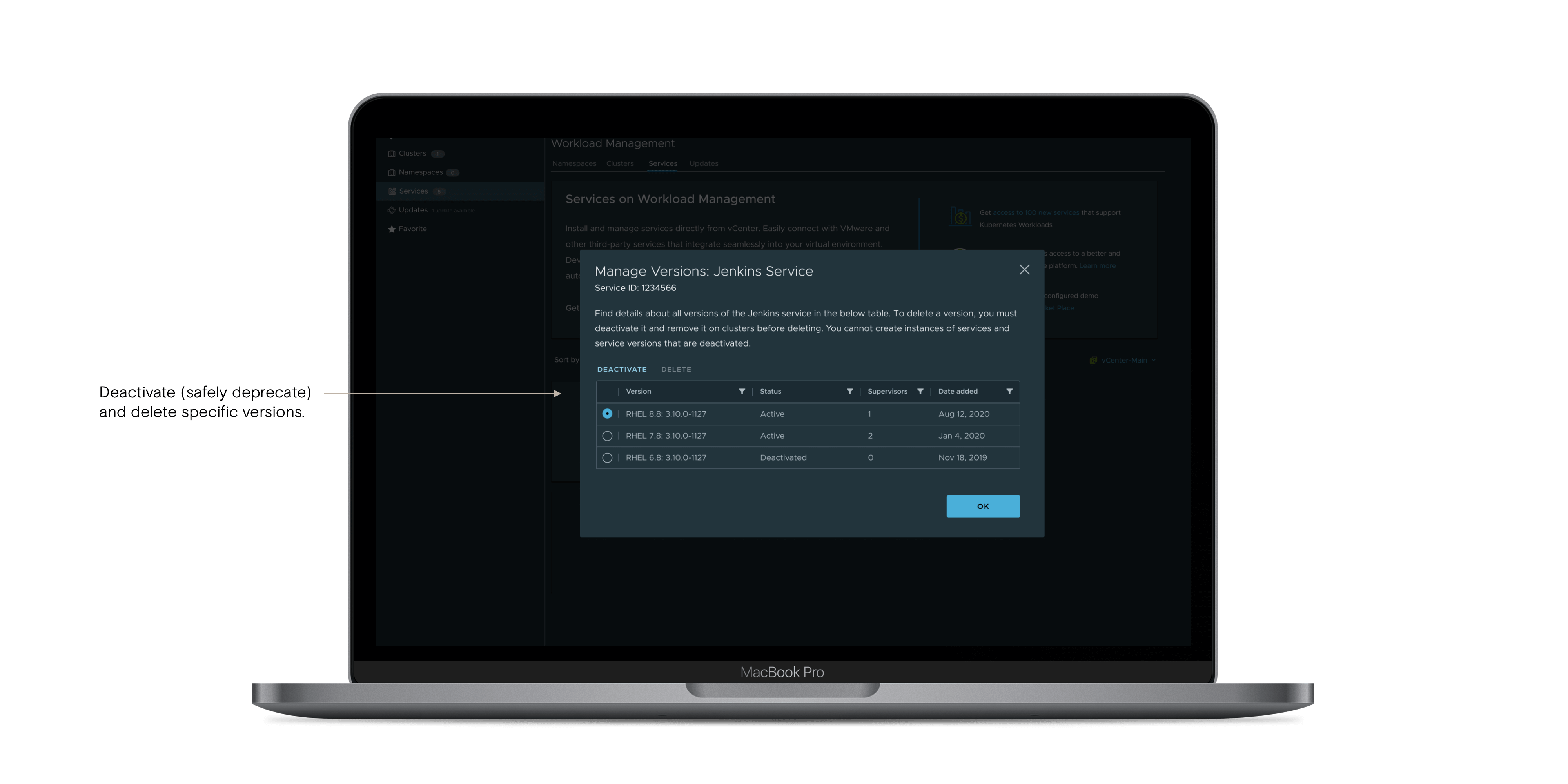
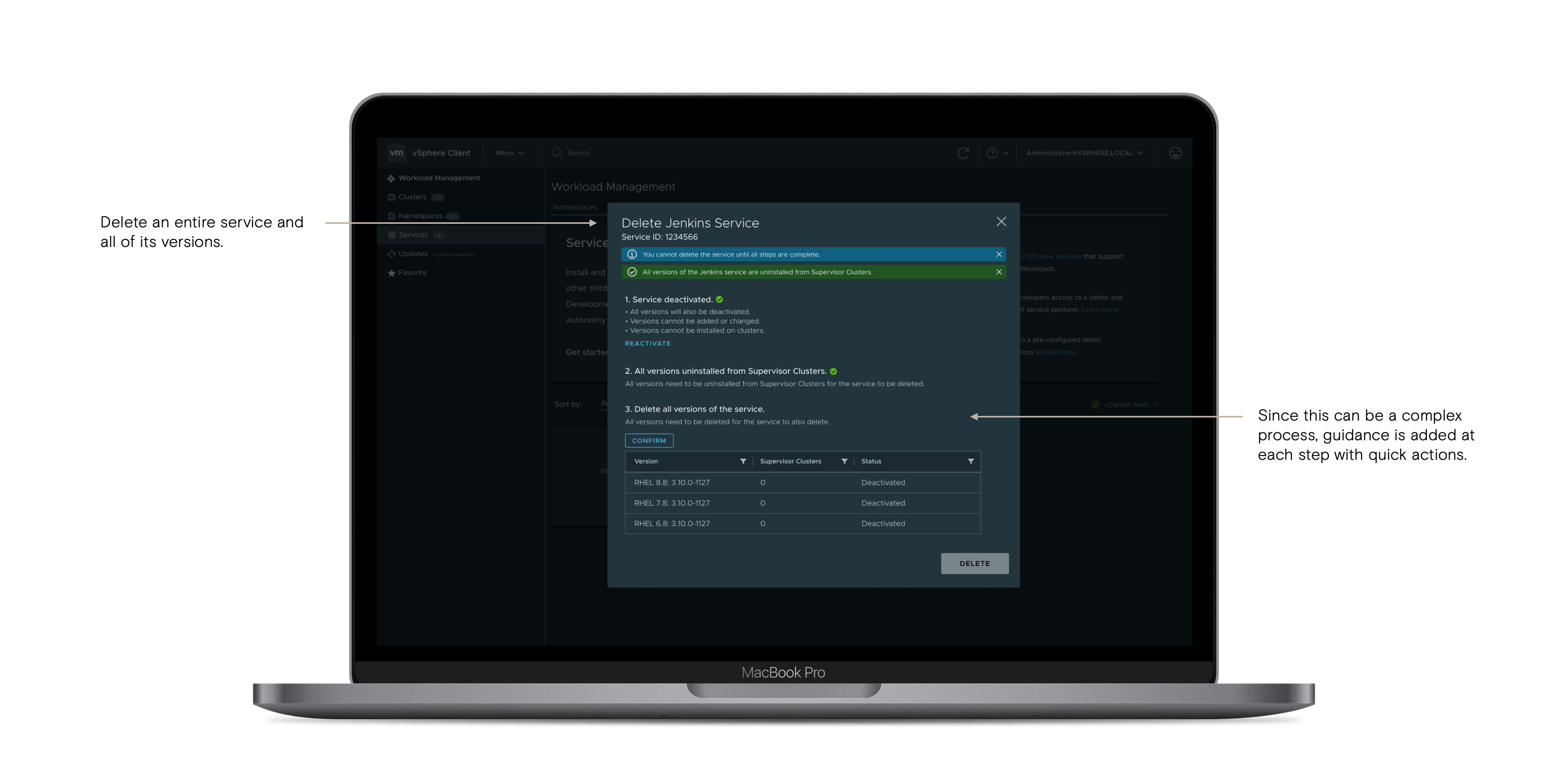


USER VALIDATION
I validated our final direction and experience with users through usability testing sessions.
During user testing sessions, users validated our approach of having a centralized location to manage services. They also expressed their interest in discovering new services, which matched our expectations and future plans.
DEVELOPMENT SUPPORT
Developers were involved since the beginning, so they had the context needed to implement designs. I worked closely with them to refine the experience and evaluate any tradeoffs we had to make.
During this process, I helped the UI team refine their implementation details biweekly through UI reviews of screenshots and live environments. Items such as copy, spacing, and interaction details are refined during this stage. API discussions were also being held periodically during design reviews so that Backend and UI teams could identify and prioritize different flows that needed to be built.
METHODS:
- Reviewboard (screenshots - fit & finish details)
- Demos (interactive - looking at overall look & feel)
- Sprint Meetings (planning, unblocking)
- Live Environments (interaction elements)
- 1:1s (as needed)
METRICS
Our UX team recognizes the need for detailed metrics, and we are working with Product Management to introduce better metrics for our feature releases.
While this process is still a work in progress, some metrics I am hoping to track for this project include:
- Feature usage
- Task completion rates and time to value
- Advanced vs basic usage
- Error scenarios
INFLUENCING FUTURE ROADMAP
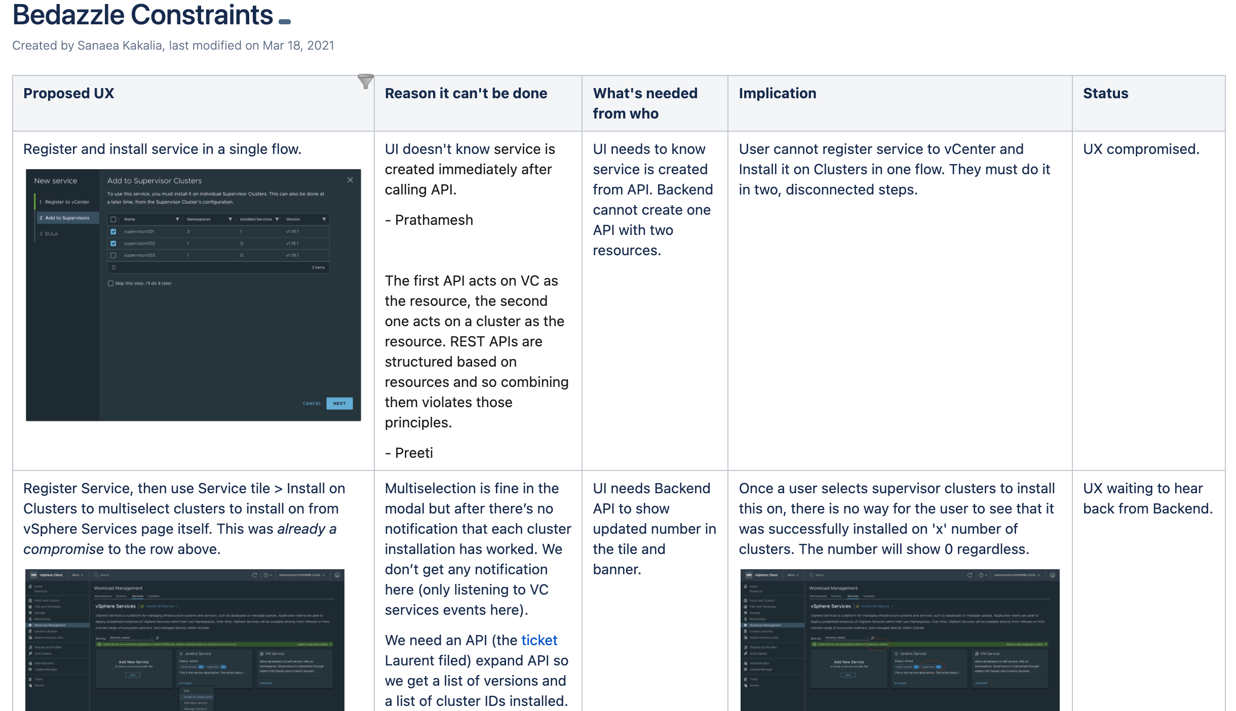
I made sure to document UX tradeoffs so that I could resurface them during later Product Management's Quarterly Priority Planning. Since these designs were discussed during the project, it made it easier to scope for future planning.
Some of these constraints were big blockers for what I saw as the “Priority #0” critical UX needed for a shippable experience. While I did have to eventually compromise for some of these, I made sure to document them in a way that captured the ideal experience, why it was not possible, and what the implications were. I made sure to then bring up these UX compromises for post-MVP roadmap planning.
RETROSPECTIVE
With numerous PMs, a constantly changing vision, and lots of complexity, I initiated retros with my cross-functional team to evaluate how the project went and what we could do differently next time.
I received a lot of positive feedback from my team, since this is not something done often at VMware.
- Explicitly defining usability’s acceptance criteria was a key learning for me. In large, complex flows, it was difficult for the engineering teams to know what flows to prioritize and what flows I thought were required for a shippable project. This is something I plan to clearly outline in my future work.
- Discussing APIs during design reviews, before the design direction is finalized, is critical to keep the project moving forward and avoid reopening closed designs.
IMPACT
I was the lead designer for a high-profile project that redefines VMware’s largest product into a service-centric platform, driving VMware’s top business priority of transformation to SaaS and empowering modern application teams.
FOR OUR USERS
Empowering our users with more control, autonomy, and optimized workflows that saves them & their companies time and money — so they can focus on building modern applications.
FOR THE BUSINESS
vSphere retains current customers by increased user value, and encourages new user adoption of the product’s premier license.
FOR THE TEAM
Built trust cross-functionally through distilling an ambiguous problem space into a north star and actionable steps forward. Aligned stakeholders through data-driven, human-centered design.