OVERVIEW
I was the first designer on this project and my research, strategy, and early designs laid the foundation for PayPal Key, a product created for the underserved financial community.
TIMELINE
June 2018 - September 2018
ROLE
Lead Designer — user research, strategy, design, testing
TEAM
Product Management team
Product Designer (me)
CHALLENGE
Create a seamless virtual card experience for the underserved financial community and the rest of PayPal's user base.
USER NEED
Customers are limited to where they can use the money in their PayPal account, especially considering giant retailers like Amazon do not offer PayPal as a check-out option. This is especially important for many financially underserved customers who use PayPal as an alternative to banks.
BUSINESS NEED
Millions of people use PayPal to shop online and send/receive money. However, only a quarter of those users choose to keep money in their PayPal account (balanced customers). PayPal needs to incentivize more people to become balanced customers, which will lead to higher engagement and draw in new customers.

OUTCOME
My contributions towards competitive research and strategy helped narrow PayPal Key's purpose, and my designs and user testing validated the concept's effectiveness.
I also created the first set of personas for my team to leverage in their product development process.
BUSINESS VALUE
PayPal can now be used anywhere, on any merchant - not just on merchants that have accepted PayPal as a payment method.
FOR THE UNDERSERVED FINANCIAL COMMUNITY
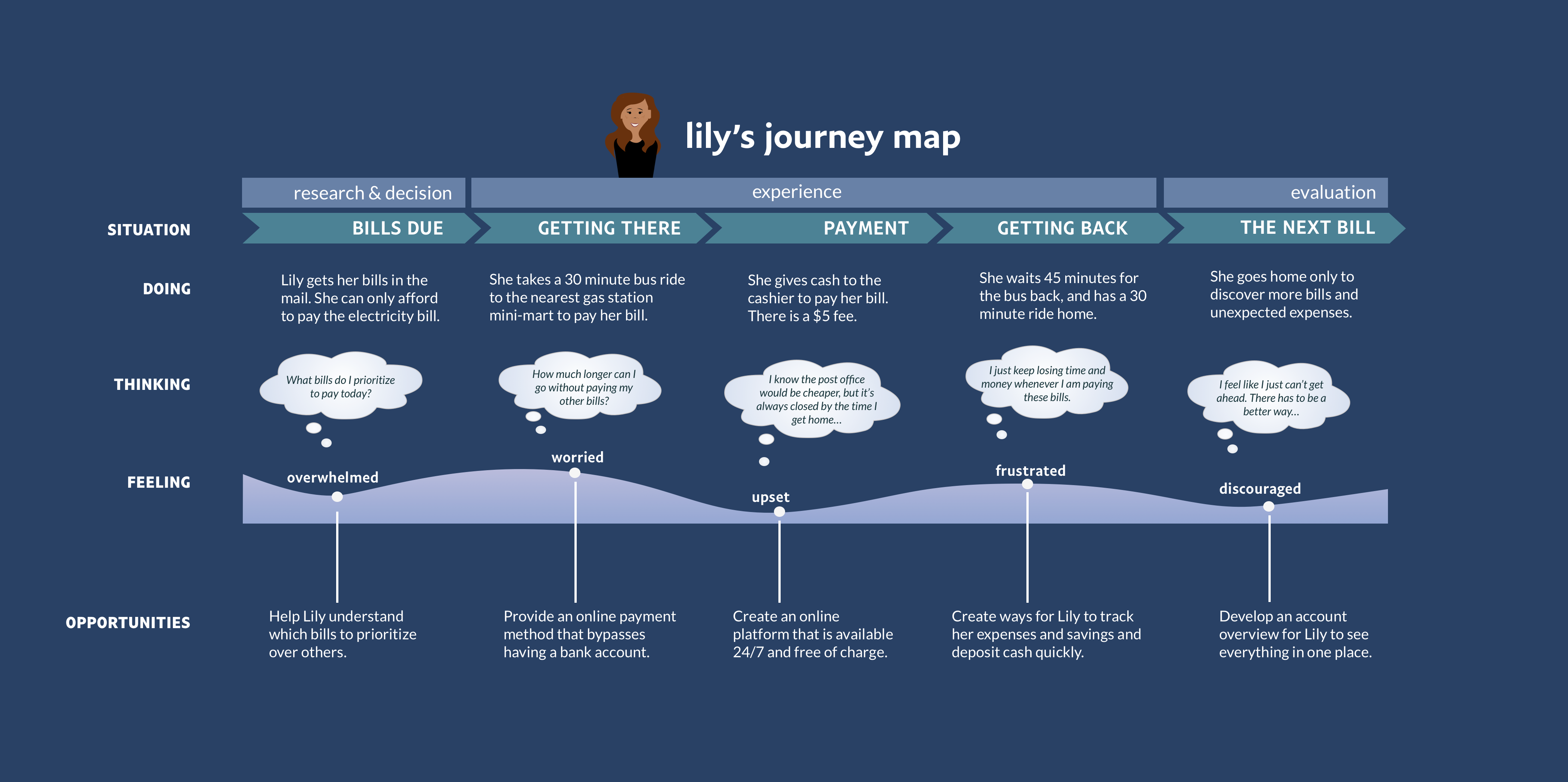
For those who may have bad credit or aren't able to acquire a card from a bank, PayPal Key allows them to pay their bills online with no credit check, and bills can be paid 24/7 - avoiding transportation costs, long lines, and missed work hours.
FOR ALL USERS
All users of PayPal Key get cutting-edge security benefits since PayPal Key does not expose the underlying card's number. This provides huge user value in the event of a data breach.

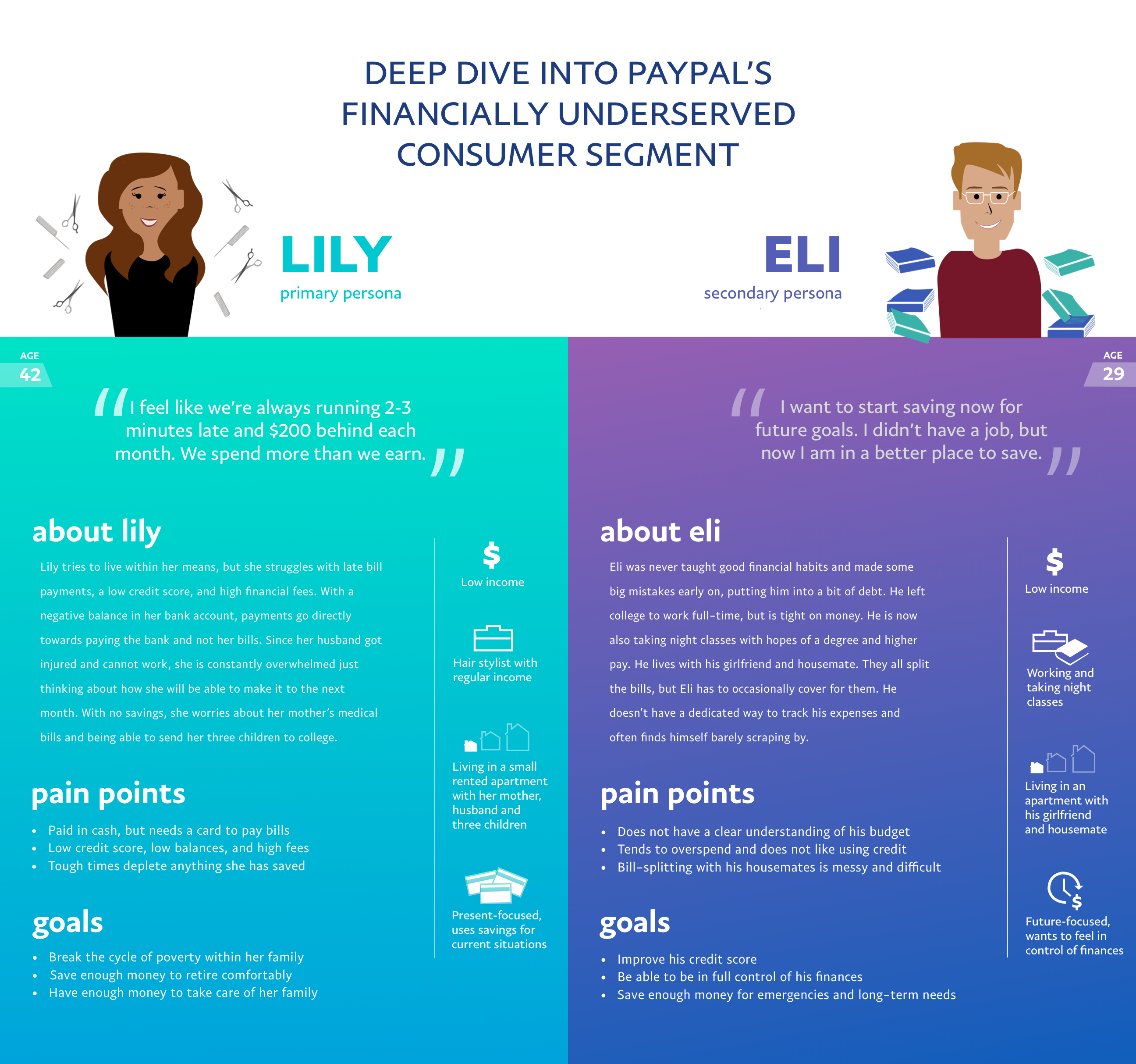
PERSONAS
I created the first-ever personas for my team to leverage during product development and to guide design decisions.
For those who have not experienced what it is like living on a tight day-to-day budget, not meeting payment deadlines, and having too low credit to take out loans from banks, it can be difficult to understand exactly who the consumer financial services (CFS) user is.
These personas were created from analyzing over 50 video interviews from PayPal users across the globe.

COMPETITIVE RESEARCH
What features do U.S. banks, international banks, and neobanks offer users today?

I created a comprehensive chart detailing different companies and their product offerings relating to a virtual card. I also gathered flows from other virtual card companies that had successful onboarding experiences.
This table highlights the most important features from top virtual cards:


USE CASES
Through my research, I uncovered the primary use case for virtual cards in the market today: security.
- Security when shopping on unknown or “shady” websites
When a user shops online at an unknown website, the virtual card masks the cardholder’s details until the transaction reaches the payment processor. - Security in case a merchant gets breached
If a merchant becomes compromised by hackers, the virtual card protects the real payment details of the user.

USER STORIES
- Use PayPal Everywhere: As an Amazon shopper that prefers PayPal as my method of check-out, I want a virtual card to use on Amazon so that I can still make purchases through PayPal's system.
- Budgeting: As a mom, I want a virtual card connected to my PayPal account so that I can give my children spending money on a limited basis, and track their expenses.
- Security: As an avid online-shopper, I want a virtual card so that I can shop safely on websites that seem shady or relatively new.
- Financially Underserved: As a low-income worker without a bank account, I want a virtual card to make e-payments to my utility services so that I can save time and money.
STRATEGY TO DEFINE EXPERIENCE
Security and Usability were the key categories we used to refine the experience for our virtual card.
Security Features (Business Need)
- One time purchase
- Merchant-specific
- Limit up to a dollar value
- Valid up to ‘X’ date
- Limiting the card use cases
- No ATM withdrawal
- No international use
- No offline use
- No top-up
- No ATM withdrawal
Usability (User Need)
- Multiple Cards
- Budgeting tool
- Nicknames, voice, tone
- Freeze ATM withdrawals/entire card
- Forms of access/use
- Browser extensions
- Drag and drop
- App copy and paste
- Regenerate
- Browser extensions
VALUE PROPOSITIONS
created in collaboration with Product Management based on User Research and Competitive Research.

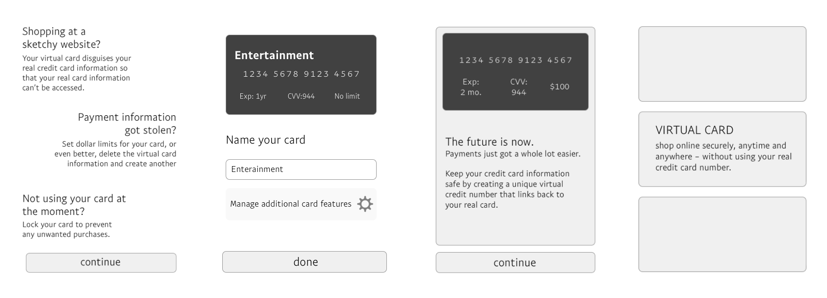
WIREFRAMES
Wireframing helped me evaluate different ways of framing the virtual card experience to first-time users.

USABILITY: PROTOTYPE TESTING
Virtual cards are a new concept for most users. Testing was critical in validating whether the concept fit our users' mental models.


Learnings:
Virtual cards were still an unfamiliar area for our users, and functioned differently from their expectations.
- While people understand that a single-use card is more secure, a multiple-use card is a more familiar concept.
- Participants prefer convenience (drag + drop, copy + paste card details) over security (and having to pull out the card at the time of payment).
- Participants found value in using the virtual cards for budgeting.
The learnings from the first user session were incorporated into the next round of iterations.

NEXT ITERATION
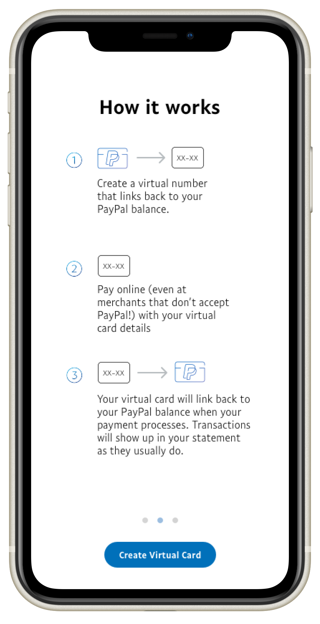
The second prototype provided the user with a more contextual flow. Users were asked to check out in Amazon, where PayPal is not supported, using a PayPal virtual card on their mobile phones.
I compiled findings after both user testing sessions to cover what worked well or not so well with users in regards to value propositions, CIP (identity verification used in payments) and card customization.

Users were excited about customizing card details, the increased security, and potentially using them as a budgeting tool with limits. Before handing off this project to the next designer, I noted down further improvements for the feature that surfaced during user testing.
IMPACT
My research, strategy, and concept validation laid the foundation for what became PayPal Key. With a concept as new as a virtual card, this groundwork was critical in users' understanding and adoption of PayPal Key.
BUSINESS VALUE
PayPal can now be used anywhere, with any merchant, even if they don't accept PayPal as a payment method.
UNDERSERVED COMMUNITY
PayPal Key allows users to pay their bills online with no credit check, and bills can be paid 24/7 - avoiding extra costs, lines, and missed work hours.
ALL USER VALUE
PayPal Key masks the underlying card's number, which provides top-notch security against data theft.
LEARNINGS
When accessibility comes first, the experience improves for everyone.
This virtual card came out of a team targeting the financially underserved market, but the card's carefully crafted features really benefit everyone. When you use an accessibility-first design approach, everyone wins from the resulting experience.